Love Out Loud is a personal development ecosystem run by Nicole Gibson, mental health and systems thought leader. Together we created what would be known as inTruth, a startup poineering the worlds first biometric emotion tracking app.
Over my time at inTruth, I played a crucial role in creating the product from the ground up. I designed the initial research study and multiple interface concepts, crafted investor decks, and worked closely with neuroscientists, data scientists, developers, and advisors. This collaborative effort guided the project through various stages, from conceptualization to the alpha version, ensuring scientific accuracy and user-centric design throughout. My strategic and design input was crucial in securing investment, supporting a bridge round and accelerating us towards Series A six months ahead of schedule.
24+ months
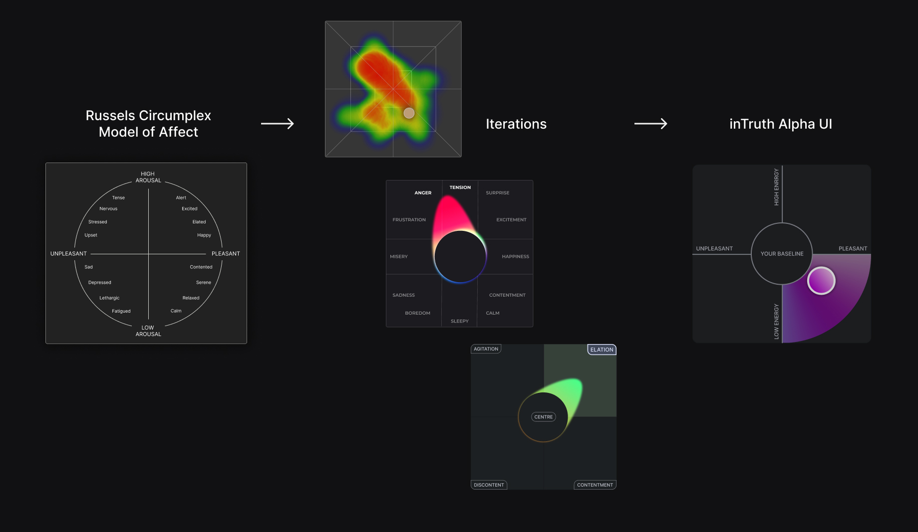
Representing emotion data in a user-friendly and scientifically accurate manner was a significant challenge. Unlike existing models that used stress graphs or emojis, we aimed to visualize both arousal and valence in two dimensions, which was unprecedented. Ensuring the representation was accurate without misleading users based on biases required constant iteration and testing.
Additionally, creating these visuals before validating their feasibility in the study was necessary to attract investor interest. Collaboration with neuroscientists, data scientists, and developers was essential to refine the UI design, ensuring it provided meaningful insights without compromising on accuracy or usability.
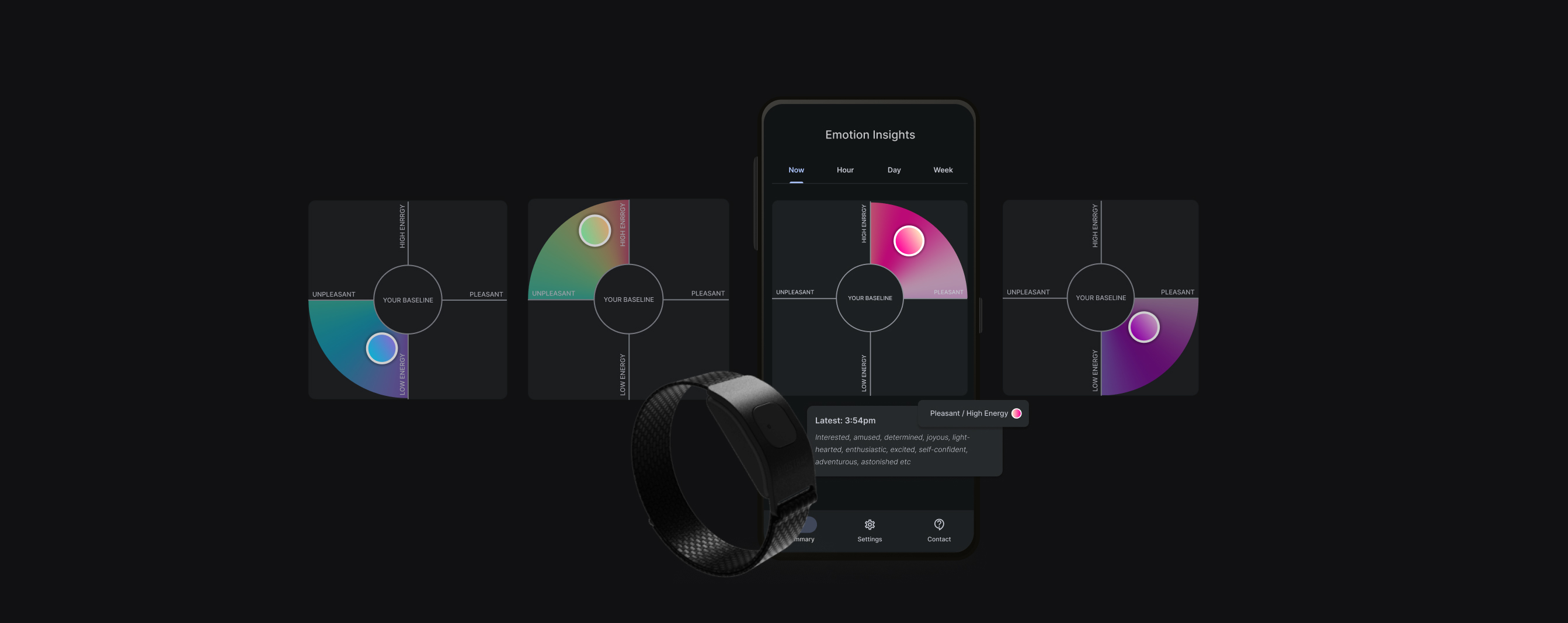
During the concept phase, we planned a research study to prove that we could measure emotion, but I needed to visualize the potential UI for investors without real data. Initially, I considered a heat map to display where emotions had been dwelling, but it felt too scientific and inaccessible. Drawing inspiration from music equalizers, which change with the beat around a circular center, I integrated this idea into our graph. This became our proof-of-concept UI, which we later named the 'flame,' as it stretched to the edges of the graph to indicate emotion intensity. To represent trends, I had to name the emotion quadrants for reference, which was challenging due to the vast vocabulary for emotions. I experimented with various terms but reverted to scientific terminology to avoid bias.
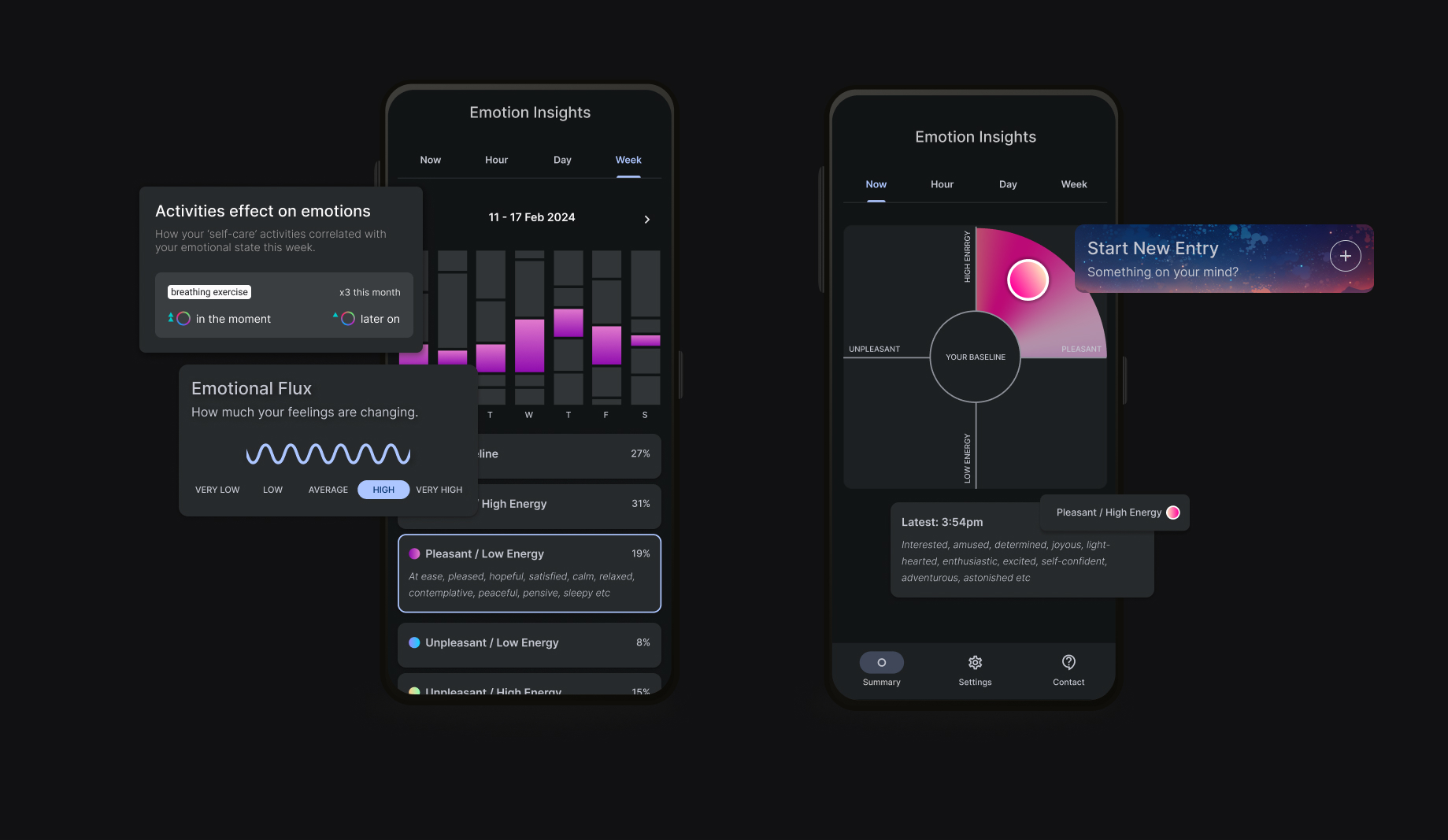
Once the concept was proven, we implemented the UI with the flame using the material design system, aligning with the developers' use of Flutter. I added features for users to shift their emotions based on past activities and use a diary to track these activities. After completing the study and developing a working ML model, we fed real data into the proof-of-concept UI, revealing some design assumptions didn't fit. For example, the intensity concept didn't align with the ML model calculations, prompting further research. In the alpha UI, I replaced the flame with a dot and adjusted the colors to blend into a circular gradient. The data was organized into hourly, daily, and weekly trends, and further iterations were made based on user feedback.
The project culminated in a series of significant milestones. We ran a small-scale scientific study to validate our concept, followed by internal proof-of-concept (POC) testing. Throughout the process, we made several development and ML model tweaks to refine our approach. The design and development of the alpha version included extensive alpha testing, ensuring the product met our standards for accuracy and usability.
inTruth are currently in the process of becoming beta-ready on several development tracks, setting the stage for broader user testing and refinement. The innovative design and compelling UI played a crucial role in securing funding, supporting a bridge round, and accelerating the timeline for Series A funding by six months.
I was responsible for creating a user-friendly interface that accurately represented emotion data. I began by researching various visualization methods and ultimately developed the 'flame' visualization inspired by music equalizers. This innovative design balanced scientific accuracy with user accessibility. I conducted iterative testing and refined the interface based on user feedback and real data from our studies, ensuring that the final design was intuitive and engaging.
I worked closely with neuroscientists, data scientists, developers, and advisors to align the product's scientific foundations with its technical implementation. I facilitated regular meetings and workshops to ensure that our design decisions were informed by the latest research and data capabilities. This collaboration was crucial in developing a scientifically grounded and technically feasible product that met our high standards for accuracy and usability.
I played a key role in shaping the overall direction and strategy of the project. I helped design the initial research study and created multiple concepts and investor decks to secure funding and stakeholder buy-in. My efforts were instrumental in securing investment, supporting a bridge round, and accelerating our timeline for Series A funding by six months. This strategic vision ensured that we stayed focused on our goals while adapting to new insights and challenges along the way.
This project taught me an immense amount about the intersection of commercial and business needs with product development. Being instrumental in strategic decision-making for our go-to-market (G2M) strategy, I learned how to craft compelling narratives for investors and stakeholders, ensuring that our vision was clearly communicated and aligned with market demands. This experience underscored the importance of balancing innovative design with commercial viability, allowing me to develop skills in creating investor decks, participating in funding rounds, and strategically positioning our product in a competitive landscape.
I pushed myself to maintain a delicate balance between user needs, scientific accuracy, and the constraints of our data output for visualization. Designing an interface that was both user-friendly and scientifically valid required continuous iteration and close collaboration with experts from various fields. I learned to adapt quickly to new data and feedback, refining our visualizations to ensure they were both accurate and intuitive. This process honed my ability to integrate diverse perspectives into a cohesive design while staying true to our core mission of providing meaningful insights to users.
A project I will never forget.
